
This week, I’ve been working on a custom card deck. I’ve found several potential vendors, each with slightly different formatting requirements, but with Affinity Publisher, reconfiguring the canvas size and margins isn’t very difficult.
Making a custom card deck also isn’t technically difficult if you have design experience, but you still have to make a bunch of design decisions…typically. In designing Plane, I’ve already done a lot of that foundational design work. Starting with that framework—an existing color palette, suit icons, and an overall look—makes the deck creation process go much faster.
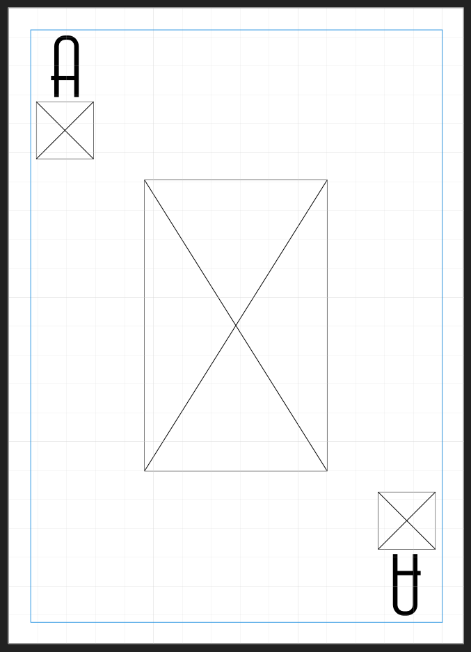
Speaking of frameworks, the first thing I did was create a template by arranging some image and text placeholders. These basic elements make it simple to determine where design elements should go and ensures each card layout will be consistent, even though their designs will all differ.
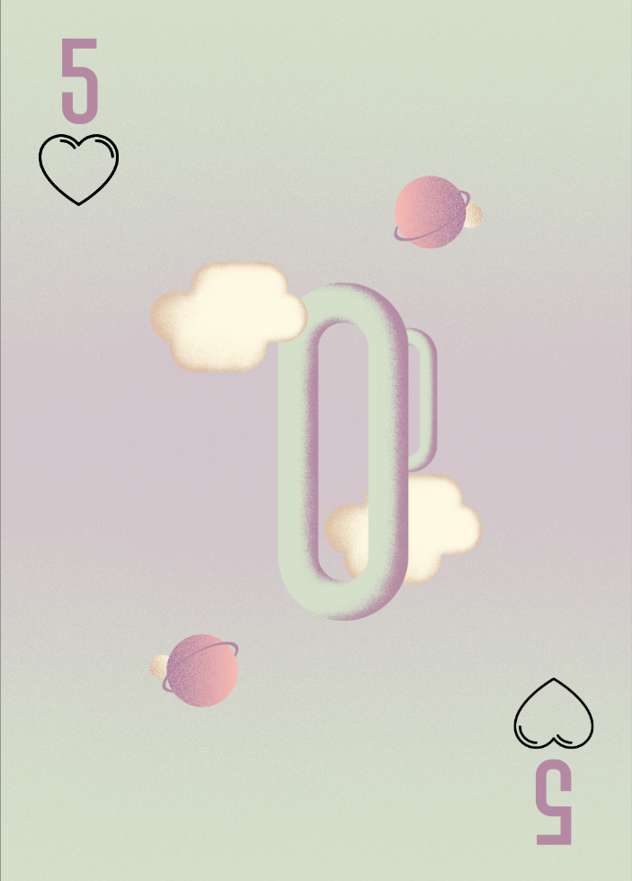
Once that was done, I started playing around with the fun stuff—backgrounds, colors, and interior art. The font we’re using (Air Americana, only available in demo form until December) has a few stylistic quirks. Some numbers require a bit of manual repositioning to make them look truly centered. (This isn’t abnormal. A lot of fonts, particularly stylized ones, need to be bumped around a bit in situations like this.)
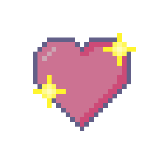
I created the card art in a separate Affinity Publisher file, saved it as a PNG, and placed it within each card template. The hearts cards are all done…for now. The art might change, because I’m not 100% sure I like the uniformity.
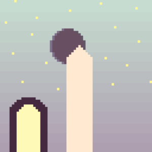
Most playing cards are invertable; the design looks the same regardless of how the player holds them. I haven’t decided whether I want to go that route or allow for some variation, as I have here, with the cloud on the lower half being behind the loop. I might establish sets of elements for each suit (for example: the loop, cloud, and planet pair for hearts cards) and make each card within the suit unique by arranging those elements differently.
The idea of an inverted design doesn’t appeal to me as much as the idea of designs that have invertable core elements (like the central loop in the card pictured) but totally different upper and lower halves. It seems more thematically appropriate for the upper and lower halves to differ in subtle ways, just as parallel universes do.
One thing I am certain of is that I’ll be obsessing over this for the next week.