The biggest (and saddest) announcement I have this week is this: I have learned to make shapes and apply grainy gradients. I started designing Plane using this pack of graphic elements, arranging and combining them to form funky structures and dreamy landscapes, but it wasn’t long before I started to feel limited and grow frustrated.
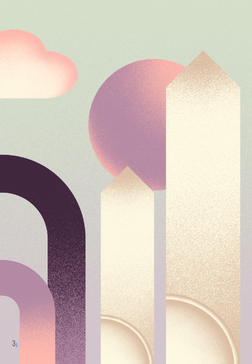
My BFF Nick said, “God, you’re so annoying. You could watch a Youtube tutorial and learn to do this in five minutes.” When I grew tired of challenging myself to design the entire game book with the graphic pack, I caved and did exactly that. (He was wrong. It actually took about fifteen minutes.)
Having the ability to make my own shapes is awesome. As far as graphic design skills go, this is a pretty basic one, but I feel accomplished. My shapes blend in seamlessly, and I’m so happy with how things are coming together, I’m considering making premium art prints available as a Kickstarter add-on.
Speaking of Kickstarter, Kanishk and I started drafting our campaign page this week, experimenting with tiers and how to introduce people to the game’s quicky, whimsical world.
Separately, I’ve been drafting marketing materials, including the script for the trailer I’ll be creating before we launch the campaign. (I love this part.) Subscribe to our Youtube channel to see the Plane trailer as soon as I upload it!
